Porch
PORCH is a small, grassroots hunger relief organization. Every month, Porch Neighborhood Coordinators collect food and cash donations, and then volunteers sort fresh and non-perishable food before distributing it to local families, pantries, and schools.
Overview
As a UI/UX designer at App Team Carolina, I’ve spent nearly a year bringing our Porch Donation mobile app to life—crafting an MVP designed for both appealing design and ease of use. Beyond designing and editing the user experience to the finite detail, I heavily assisted the user interview and testing process, aiming to gain insight into how we can best streamline the donation process.
The Problem
An intuitive mobile app is needed to simplify the donation process, track logistics, and improve coordination between donors and volunteers, ultimately increasing the impact of Porch’s mission.
My Role
Joined on as one of two UI/UX designers in the middle of the design process to assist in creating a more user focused design,
Duration
The overall project has taken place over two years and I have been involved for nearly a year.
The Team
2 - UI/UX Designer
4 - IOS Designers
3 - Backend Developers
2 - Product Managers
Solutions
Text Blasts
The implementation of a logistics screen has the opportunity to increase the documentation of crucial data. Being able to easily track these statistics allows for more accurate donation summaries and increased efficiency.
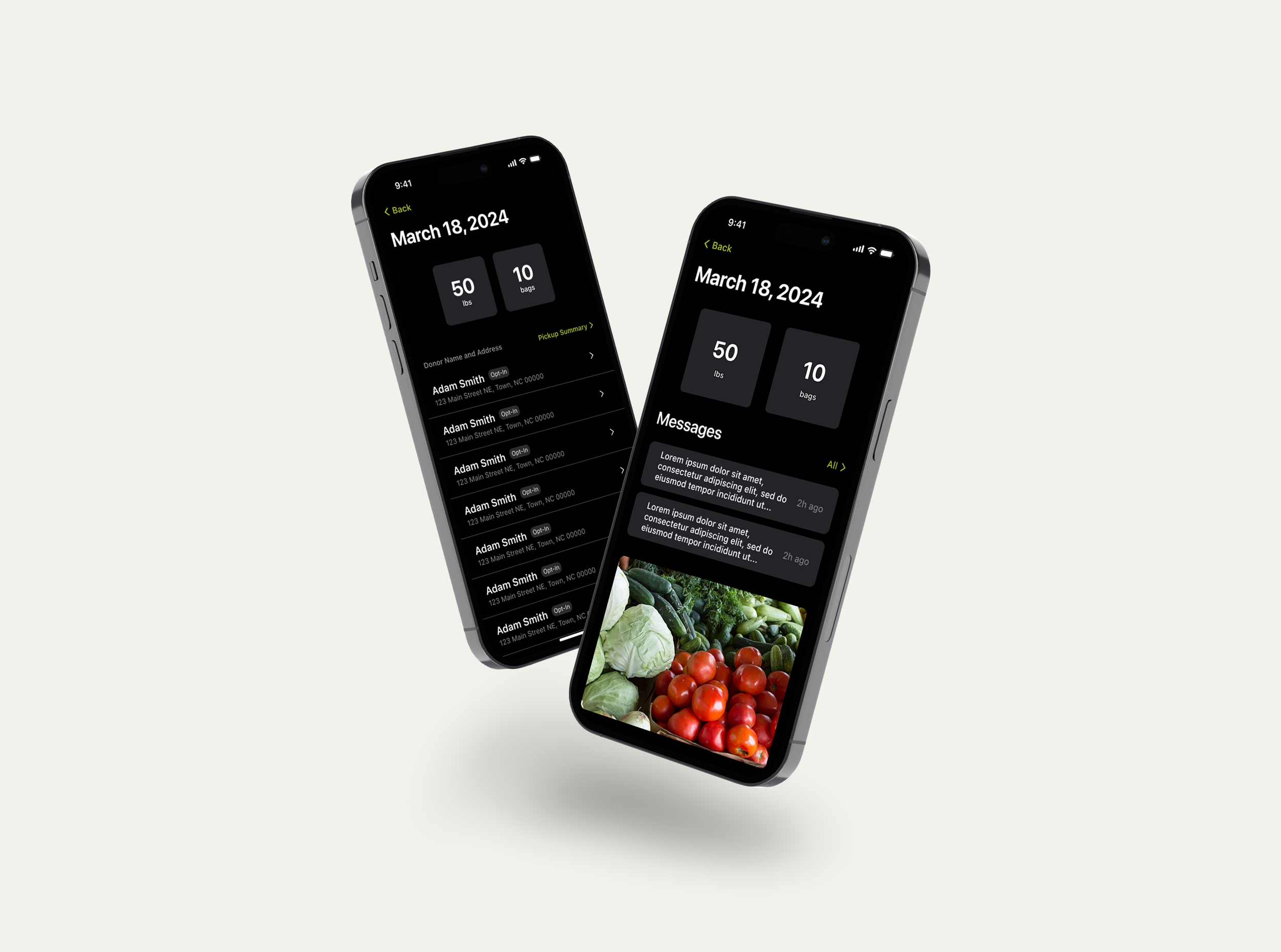
Logistics Screen
The implementation of a logistics screen has the opportunity to increase the documentation of crucial data. Being able to easily track these statistics allows for more accurate donation summaries and increased efficiency.

Donor Editing
Ease of editing allows volunteers to quickly change important details such as address and phone number or add new donors. Being able to change contact information on the fly allows volunteers to keep in touch with donors even through moves or number changes.

My Process
User Testing/Personas

Since I joined this project after the initial design was created, user testing and personas were essential in identifying key pain points and refining my design focus. My goal is to prioritize what matters most to users and ensure those tasks are easily accessible. Through this process, I gained valuable insight into the challenges of running a charity—it often functions as a second job, making efficiency crucial. Designing an interface that streamlines essential tasks can be a game-changer for users managing these demanding responsibilities.
Redesign
Using the information from user testing and personas, I went back to designing the key processes within the app to try and make them more intuitive.

Pickup Process
Redesigning the pickup process to be straightforward with clear buttons without a surplus of text was necessary to have the essential task accessible to anyone regardless of their knowledge of technology.

Adding or Editing Donors
Another crucial redesign was the user flow to add or edit a donor. I wanted this process to be more akin to editing or adding a contact on a smartphone, which nearly everyone has done.
The Future
-
With the MVP complete, the focus now shifts to launching the app and collecting valuable user data. The next step is onboarding early users to test and validate the core functionalities, ensuring the app meets their needs and performs as intended.
-
My team and I will analyze data from early users, leveraging their feedback to refine and optimize the app. By identifying pain points and addressing usability challenges, we can enhance the overall user experience and improve key features.
-
The final step is to continuously refine and scale the app, ensuring it evolves to meet user needs. This includes exploring new features, tracking additional data, and enhancing functionality. Additionally, my team will focus on integrating the app with other platforms, such as navigation apps, to expand its capabilities and improve the user experience.
Key Learnings
Design vs. Usability
Throughout this project, I initially focused on creating visually complex designs to make elements look more advanced and eye-catching. However, I have shifted toward a more user-centered approach, prioritizing clarity and functionality over unnecessary complexity. This shift has resulted in more intuitive user flows and improved feedback during user testing, reinforcing the importance of designing with the end user in mind.
Working with Developers
Collaborating with App Team Carolina has given me firsthand experience working closely with both iOS and backend developers. I’ve learned how to bridge the gap between design and development by understanding what streamlines their workflow and how I can adapt my designs to be more feasible and efficient to implement. This collaboration has reinforced the importance of clear communication and technical awareness in bringing a UI concept to life.
Working with a Client
Developing strong communication skills has been essential in my work with Porch, particularly when engaging directly with clients to understand their needs. Through face-to-face discussions, I have learned to ask insightful questions that uncover their core priorities, ensuring that the UI design aligns with their expectations and enhances the overall user experience. This ability to translate client feedback into actionable design decisions has been a key aspect of my growth as a UX designer.